In celebration of the National Chocolate Day, we decided not only to eat chocolate all day long on October 28, but also to learn something new. For example, all of us know pretty well how chocolate is consumed. Many of us will even claim that are experts in the field. But how many of you really know how chocolate is made?
It is presumed that chocolate beverages have been in use for over three thousand years, which basically makes chocolate almost as old as first great civilizations and even older than written language in Mesoamerica. This beautiful product comes from the tropical cacao tree that has a strong, bitter taste, so cocoa seeds need to be fermented. Afterwards the beans are dried and roasted, the shell is removed and the cacao nibs that are left are ground into cocoa mass which is then liquefied – that is called chocolate liquor and it can be made into solids or butter.
How Chocolate Labels and Packaging Affect Consumers
The production process is usually of less interest to consumers. What they relish in is the taste of chocolate, but true chocolate connoisseurs also appreciate one more thing – how chocolate is packaged. The product’s packaging and labels go a long way. When they are stylishly designed, they can be to blame for breaking chocolate non-eaters’ vow not to eat this delicious treat.
There are too many chocolate brands, wrappers and chocolate labels in the world for us to even mention them here, but today we decided to share with you 7 designs that we especially like. This collection of lovingly created designs might inspire you to try to create something similar using Labeley.
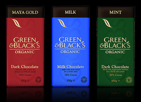
1) Let’s start with a classic clean look of the Green & Black’s chocolate packaging designs. All the important information about the product is visible, and the simple design shows elegance, class and authority.
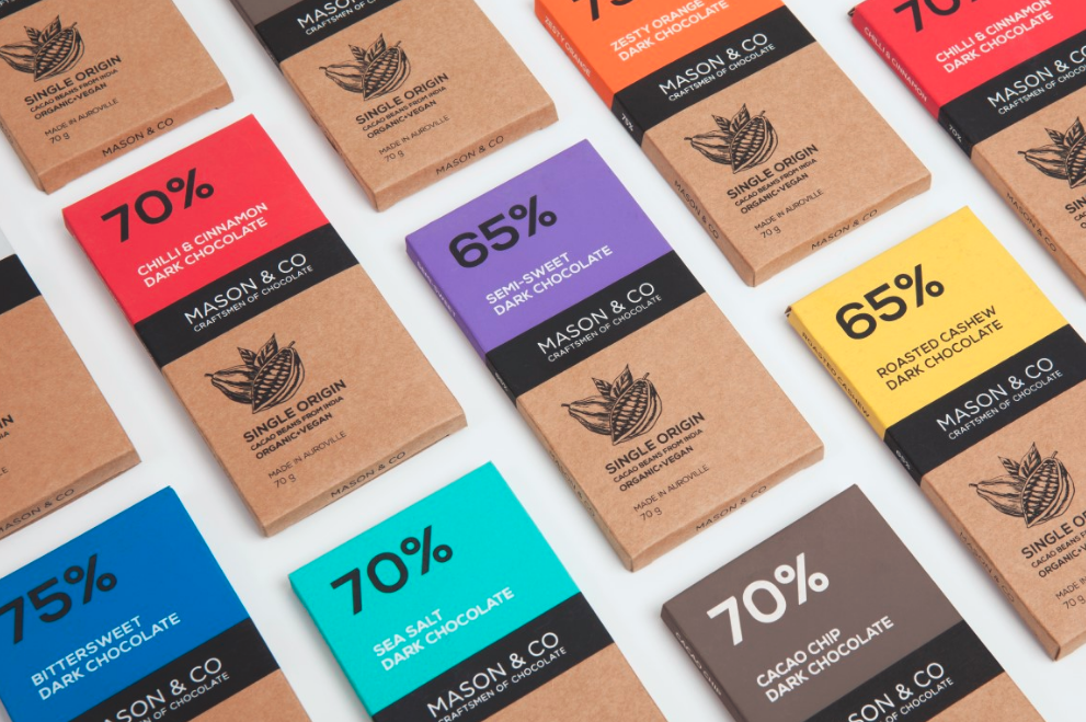
2) Mason & Co follow the same tradition, except their design doesn’t completely follow the classic line. It’s a mix of the traditional and modern, and definitely focuses more on the natural, healthy and environmentally-friendly elements of their production.
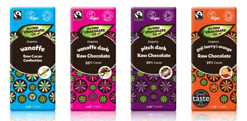
3) The Raw Chocolate Company is a Swedish chocolate manufacturer whose founder has set out on a mission to make chocolate better for consumers, growers, the environment and especially for children. So, whoever is concerned about intaking too many calories, they will be appeased by the natural and healthy factors of these delicious raw chocolates (and their colorful chocolate labels).
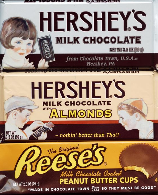
4) Hershey’s is always among the favorite 10 chocolate brands among the U.S. population. Here’s an older version of their chocolate packaging that will appeal to vintage design lovers:
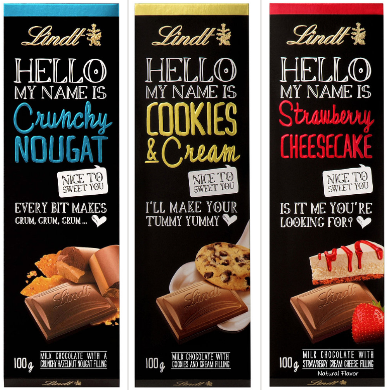
5) Vertically oriented chocolate shapes seem to be gaining in popularity. Here’s how the popular Swiss chocolatier, Lindt, decided to lure their fans with a new packaging. Notice the fun and creative messages on their chocolate labels.
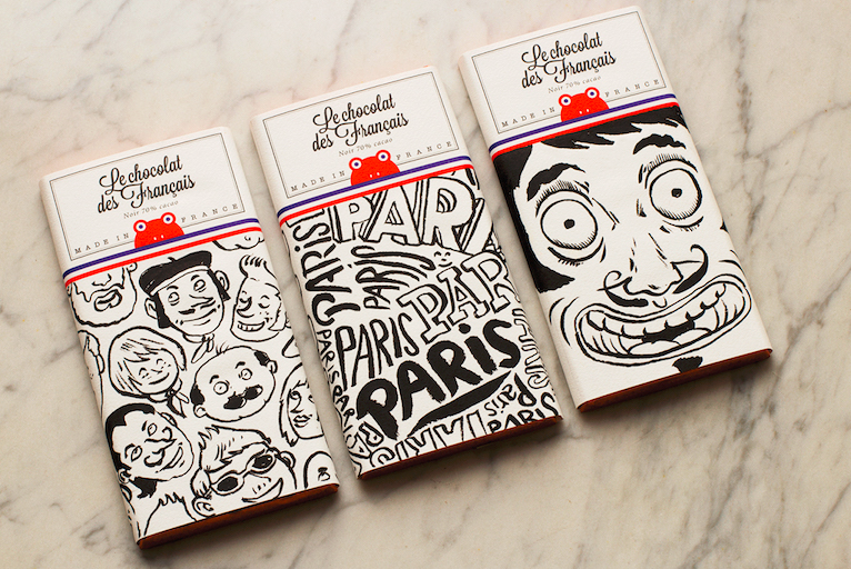
6) Les chocolats des Français is a French chocolate company that puts a lot of stock in illustration, as we can see on the photo. Their goal is to make people enjoy their chocolates visually as much as they enjoy the taste.
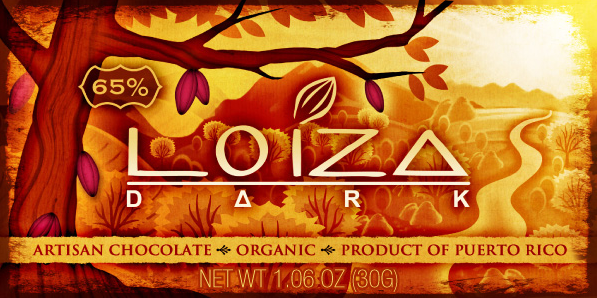
7) And finally, here’s a chocolate packaging design by Loiza dark that evokes the landscape of the chocolate’s original setting, the Mesoamerica.
If you like what you see, head over to Labeley free web app to create a neat chocolate label that you can use to personalize a sweet gift for someone special.

